Advertising your business is crucial to the long-term success of the company. Whether you need to come up with marketing materials for your next tradeshow or just want something sleek and new for your lobby, banner stands can be an effective form of advertising when done right. If you are thinking about investing in some banner stands, you should keep these tips in mind to design an effective stand.
Choose the Right Material
First and foremost, you will have to select the type of material you want your sign to be printed on. In general, you can choose between fabric and vinyl. Both have their advantages, so you will need to consider the application and location where your banner stand will be located when you decide which material will suit you best.
Think about the images that you will display on your banner stand. Fabric is better for images that have a lower resolution and may come out a bit blurry on vinyl banners. They also do not reflect the light, so you don’t have to worry about visibility. This type of banner does fade faster, so you will have to replace it more frequently than a vinyl banner.
If you have lots of images that are high resolution and sharp, then a vinyl banner may be the ideal choice for you. The printing tends to come out crisper, and it lasts longer than a fabric print. The only thing to be aware of is that a vinyl banner can reflect light which might not be ideal if you have lots of harsh overhead lights.
Banner Size
Many marketing professionals are puzzled by what size their banner stand should be. They come in a variety of sizes, but you need to figure out what will work best for your business. Talking with a professional sign company can help, but there are a few other rules of thumb you can keep in mind.
A good banner stand should be large enough that it catches the attention of passersby. It should also be able to accurately convey your entire message without making the text or images so small that they aren’t visible at a glance.
On the other hand, you don’t want your banner stand to be cluttered with information. A banner that is too small might be trying too hard to cram a higher volume of information onto the vinyl or fabric. You should have some negative space or white space to balance out all of the text and images on the banner.
Finding the perfect banner size is a delicate balance between making it too small and making it too large for a given area. Consult with design professionals if you need help deciding on size.
Call to Action
A banner is only effective if it promotes your underlying marketing goals. You want it to be more than just a pretty sign that catches the attention of your customers. You want it to move them to action and to a deeper relationship with your brand. This is why it is a great idea to design your banner stand with a call to action included.
Don’t make this overly complicated. A good call to action can be short and sweet, giving your customers the next steps that they can take. Make sure these next steps are clearly outlined on your banner stand, whether that means taking a brochure, asking for more information, or setting up a consultation with one of your experts.
Remember that your banner stand should also contain your contact information. If you want your customers to engage further with your brand, they need to know how to reach you. Be sure to place contact information near the shoulder-height mark of your sign instead of at the bottom. This makes it more likely that customers will see it and remember to jot it down.
Keep Design Principles in Mind
If you are having a hard time designing your banner stand, you can start with the hallmarks of a great design. Begin by choosing a font that is easy to read at a quick glance. Script and other complicated fonts are often not the best choices for a banner stand where you have just seconds to capture the attention of your clients. Make sure that the text is legible and clear on your banner.
You should also consider the colour scheme that is worked into your banner. Using your brand colours is a good idea to keep your messaging consistent. Another idea is to use contrasting colours such as black and white or black and yellow. These colour schemes make your banner really stand out at a tradeshow or even in your lobby.
If you aren’t sure what colours to use, consider the psychology behind colour. You might want to select a colour based on how it makes your customers feel when they look at it. For example, blue and green tend to be more soothing colours, while red is loud and attention-grabbing.
Use High-Quality Images
Many people are tempted to use photos that they took themselves, but there can be a downside to these pictures. They often are not high quality and can reflect poorly on your Winnipeg banner stands. Even if you are printing on fabric, it is important that your pictures look as crisp and clean as possible when enlarged to banner size.
You might find that a low-quality image can really detract from the effectiveness of your banner stand. People will be more apt to engage with you if your printing materials look like they have high quality, and that starts with high-resolution images and text.
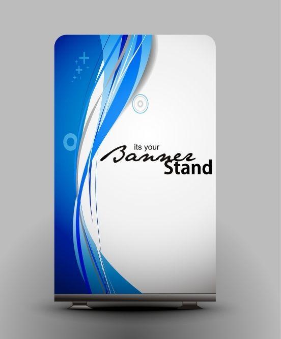
Designing Your Banner Stands
When you are ready to design your next banner stands, you’ll need the help of the experts to make your design truly pop. SpeedPro Winnipeg North has the experience you need to craft a beautiful banner stand with high-quality images and design. Give us a call today to learn more about how we can help your design!