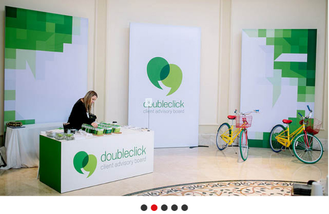
Gone are those times that visitors expected to be confronted with mountains of product literature. Whether there is a tight design budget or if you are merely attempting to set the booth apart within a crowded hall, a minimalist design will provide a modern, inviting, and fresh alternative to busier layouts. Below we list some useful design ideas to ensure your booth does not cause visitor overload:
- Declutter the graphics. Give consideration to the overly cluttered billboards you occasionally witness alongside the highway – you oftentimes cannot know who the advertiser is, not to mention what proposition is actually being communicated. Do your signs suffer from a likewise issue? Leave an abundance of negative space within your signs in order for the viewer to concentrate on what’s more important – unutilized white space is a friend, and not an enemy.
- If the booth space is tiny, you must be particularly choosy in your selection of furnishings. That “rule of thirds” saying oftentimes applies in such situations, in which you restrict your design components to 3 areas, like an information table, product area, as well as a sales area.
- Keep lights simplistic, as well as avoid blending both cool and warm lighting. Contrast is important: If you have important products being displayed, position the brighter lighting above them, in order to assist them in standing out as a feature within the booth.
- Consider lighter selections of color for the booth. Light shades usually make spaces look bigger. Pick shades from your company that accentuate the presence of your company; however, keep it simple in order to avoid competing visual components.
- Give consideration to integrating hanging structures within the design of your booth. Suspended graphics will open the floor plan up in order to draw attendees into the booth. With that, additionally give consideration to structural or graphical methods of tying your overhead components inside the ground level in order for the attendee to connect both components, as well as remain concentrated on you, and not the competition at all levels of the booth space.
- Utilize a simplistic interactive component that increases engagement, as well as adds levity to the booth. Playful or active games can not just draw foot traffic to the booth yet may be utilized as symbols of your brand’s innovative approach to service solutions, as well as product selection.
- While the staff at your booth always ought to be accessible as needed, make certain that you build room within the exhibit for visitors to explore services or products by themselves, without having to be troubled by a sales representative.
Minimalist show design does not mean anything is actually missing from the booth. It instead, means there is an ideal quantity of what visitors actually need.
Portable/ retractable banner stands may be used for long-term advertising in your company and an excellent ROI. For more information on our quality banner stands please feel free to get in touch with Speedpro Penticton right away at 250-493-6304.


