We’ve all been to a trade show or conference where a sea of exhibitors is trying to get our attention. But how can you make your company’s booth stand out? The answer is simple: use banner stands hamilton.
Think about it this way: whebanner printing and standsn you see a friend across a crowded room, you recognize them based on their face, banner printing and stands body type, and the clothes they’re wearing. The same principle applies to businesses. Your company’s banner stand is like your employees’ faces, while your booth’s layout and design are like their body type and clothes.
Just like you wouldn’t send your employees to a networking event or trade show wearing ripped jeans and a t-shirt with your company’s logo, you also don’t want your booth to look cluttered and unprofessional.
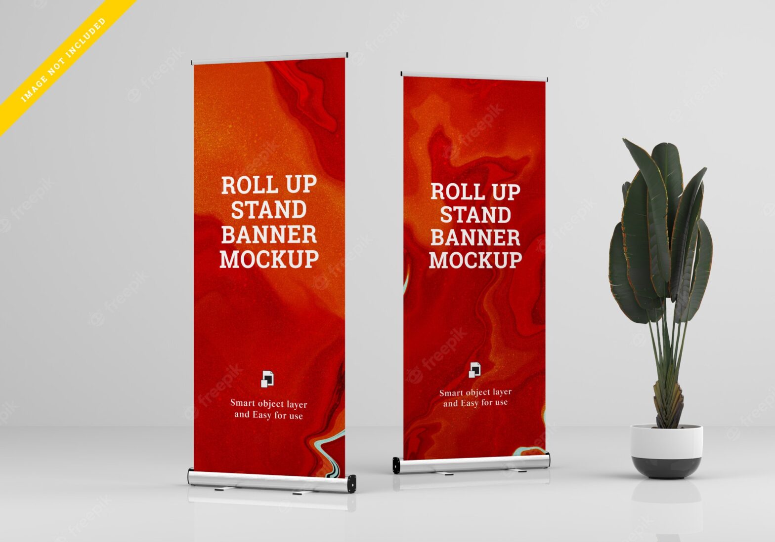
One often-overlooked touchpoint is the humble banner stand. SpeedPro has the best banner stands in Canada. It is portable, versatile, and relatively affordable, making them ideal for use at trade shows, conferences, store openings, and other events.
When designed and used correctly, banner stands Hamilton can significantly reinforce your brand identity and ensure that your target audience remembers your name long after the event. Here’s how to do it.
1. Choose The Right Banner Stand For Your Needs
Many different types of banner stands are available on the market, so choosing one that meets your specific needs is essential. Retractable banners hamilton are a popular choice for trade shows and conferences because they’re easy to set up, take down, and compact enough to transport without taking up too much space.
Selecting the right size is also crucial. You don’t want your banner stand to be too small or too big for the available space. If you’re unsure what size to choose, err on caution and go with a larger banner stand; you can always trim down an oversized banner, but you can’t extend a banner that’s too small.
2. Be Cautious With Your Colors
When incorporating your brand colors into your banner stand design, it’s important to use them sparingly. Remember, you want your target audience to remember your brand name—not just your logo or color palette. Both can be visually overpowering if there is too much of either, which makes it challenging to focus on anything else.
Per banner stand design, it’s a good idea to stay with one or two brand colors.You can use these colors in stripes or blocks to add some visual interest without going overboard. And if you really want to make an impact with color, consider using a material like vinyl that allows you to print full-color photography onto your banner stand—just be sure not to include too many colors or patterns in the photo itself so as not to overwhelm viewers.
3. Make Use Of Empty Space
Once you’ve determined which text and images you want to include in your design, take a step back and look at the empty space left over. This space is called negative space or white space—and it’s just as important as everything else in your design (if not more so).
Negative space gives viewers’ eyes a place to rest so they’re not constantly bombarded with information. This is especially important when display materials like banner stands hamilton are involved because people will likely only see them for a few seconds as they walk by.
When used correctly, negative space can also help highlight certain elements in your design, so they really pop (think of how a white border makes photos stand out on Instagram). So don’t be afraid of using large swathes of negative space in your design; it can actually be quite effective!
4. Stick To Simple Fonts
When choosing fonts for your banner stand design, less is definitely more. You want to use a font that’s easy to read from a distance—and that means avoiding fancy, decorative fonts or anything else that might be difficult to decipher quickly.
In general, sans serif fonts like Arial, Helvetica, or Futura are good choices for banner stand designs because they’re simple and easy to read. But feel free to experiment with different fonts to see what works best for your particular design. You don’t want your banner stand design to clutter up, so stick to one or two fonts max.
5. Consider Adding A CTA
Don’t forget to include a call-to-action (CTA) in your banner stand design! A CTA is a phrase or sentence that tells viewers what you want them to do next—and it can be anything from signing up for your email list to following you on social media.
Your CTA should be short, sweet, and to the point and prominently featured in your design so viewers can’t miss it. And if you really want to drive home your CTA, consider using a color that contrasts with the rest of your banner stand design to make it really pop.
Banner stands are a great way to get your brand noticed—but only if they’re designed correctly. Follow the tips above to ensure your banner stand makes a lasting impression on everyone who sees it.
SpeedPro Canada is your perfect partner in designing the perfect banner stand for your business. Finding banner printing Hamilton has never been easier. We are a premier provider of a wide range of full-service sign and advertising products with a proven high level of customer satisfaction.
Contact us today to learn more about our banner stand options and get started on your custom design!