Your brand’s colour palette is more than just a visual choice—it’s a powerful tool that shapes brand identity and brand recognition. The right colours for your brand can evoke emotions, connect with your target audience, and leave a lasting impression. But how do you choose the perfect colour scheme? Let’s break it down:
The Psychology Of Colour In Branding
Colour psychology plays a crucial role in brand marketing. Different shades can communicate specific emotions and influence how your audience perceives your brand personality. Whether you want to appear bold and energetic or calm and trustworthy, your colour palette should reflect your brand’s personality traits.
Understanding Colour Theory
Colour theory helps explain why certain branding colours work well together. Using the colour wheel, you can craft a cohesive and visually appealing brand palette.
Primary Colours
Red, blue, and yellow are the foundation of all colours.
Secondary Colours
Secondary colours are created by mixing primary colours to make green, orange, and purple.
Tertiary Colours
Tertiary colours are formed by blending primary and secondary colours, offering more nuanced branding options.
Colour Harmony And Complementary Schemes
A well-balanced colour scheme ensures that your brand colours are visually appealing. Complementary colours sit opposite each other on the colour wheel, creating contrast, while analogous colours create harmony with similar hues.
The Emotional Impact Of Colours
Your brand’s colour palette should align with the emotions you want to evoke:
Warm Colours And Their Associations
Warm colours like red, orange, and yellow convey energy, passion, and excitement.
Cool Colours And Their Connotations
Cool colours such as blue, green, and purple evoke trust, calm, and stability.
Neutral Colours And Their Uses
Neutral colours, including black, white, grey, and beige, offer balance, sophistication, and versatility.
Analyzing Your Brand Identity
Before selecting brand colours, consider your brand identity. What emotions do you want to evoke? What values do you want to represent? This will help you create a cohesive colour scheme that resonates with your audience.
Creating Your Brand’s Colour Palette
Selecting A Dominant Colour
This is an essential step, as your primary colour should represent your brand’s core values.
Choosing Complementary And Accent Colours
Choosing complementary and accent colours is an exciting part of the colour palette, as it adds visual interest and contrast.
Determining Colour Proportions
Determining colour proportions helps maintain consistency in your brand colour codes.
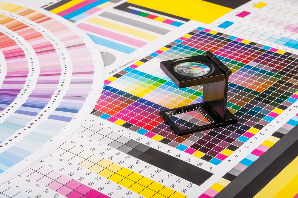
Testing Your Colour Palette
Before finalizing, test your colours across different platforms, from social media to print. Create mock-ups and prototypes to see how your brand palette looks in real-world applications.
Implementing Your Colour Palette
Once you’ve chosen your branding colours, apply them consistently across all branding materials, from your logo and website to all marketing materials.
Creating A Brand Style Guide
Creating a brand style guide ensures your brand colour codes and branding rules remain consistent.
The Long-Term Impact Of A Well-Chosen Colour Palette
A strategic colour palette enhances brand recognition, builds trust, and strengthens brand marketing. Whether you opt for bold primary colours, soothing cool tones, or a sophisticated neutral colour, a well-planned palette ensures your brand stands out on signs, digital platforms, and beyond. Contact SpeedPro Signs Surrey for more information today!