Your signage speaks before you do, and the font you choose can make or break that first impression. The right typeface helps your sign stand out, supports your brand identity, and ensures your message gets noticed at a glance. From storefronts to trade shows, fonts play a key role in attracting attention and guiding customer perception. In this guide, we’ll walk through what makes a great sign font and share top picks that balance clarity, professionalism, and visual impact:
Prioritize Readability When Deciding On A Font
Choosing the best display fonts for signs isn’t just about aesthetics. It’s also about making sure your message can be read quickly, easily, and from a distance. No matter if you’re designing storefront signs, outdoor signs, or digital graphics, readability should always be your top priority.
Clear fonts help customers understand your brand and message in just seconds. This is especially important for businesses on busy streets or in fast-paced environments where first impressions are made in a flash. A good sign font needs to be clean, legible, and versatile across sizes, backgrounds, and lighting conditions. Avoid multiple fonts, and understand that a great font can sometimes be the simplest, cleanest one. The goal is to effectively communicate—not to overdesign or distract from the core message you wish to convey.
Avoid Overly Decorative Fonts
While script fonts and decorative fonts might look creative, they’re often difficult to read, particularly from far away. These styles tend to work best in small doses or as accents, but not as the main font on a sign.
Fonts with thin strokes, swirls, or overly stylized elements may catch the eye, but often for all the wrong reasons. They can confuse viewers, make your sign look cluttered, and ultimately fail to communicate your message. Instead, save these fonts for marketing materials or brand elements where detail matters less.
Serif Vs. Sans Serif Fonts
When comparing serif fonts and sans serif fonts, both have their strengths, but the key is using them in the right context.
- Serif fonts have small lines or “feet” at the ends of letters. They’re considered more traditional and are often used in classic font designs. They bring a sense of elegance and formality, making them great for law firms, financial institutions, or luxury brands.
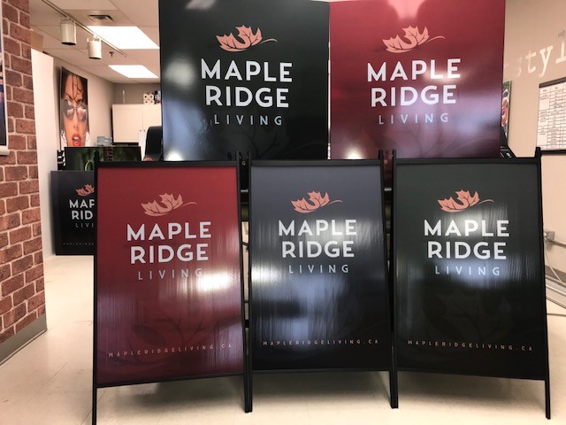
- Sans serif fonts, on the other hand, are clean and modern, without those extra strokes. These fonts are highly legible and versatile, which is why many designers use them for signs, digital screens, and outdoor signage. Their simplicity makes them one of the most effective choices for business signs.
If your brand leans modern, approachable, or minimalist, geometric sans serif fonts or simple bold fonts can help your signage stand out.
Top Fonts For Business Signs
When it comes to selecting the right font for your business sign, stick with proven, time-tested options that balance style and readability. Here are two top contenders that work beautifully for most industries:
Best Serif Font: Garamond
Garamond is a timeless serif font known for its readability and sophistication. Originally designed in the 16th century and refined for digital use, it offers a high-end look without compromising clarity.
- Great for: Law firms, universities, bookstores, upscale retailers
- Why it works: It is elegant yet easy to read, with well-balanced spacing and clean strokes
- Bonus: It scales well for large signs and printed materials alike
Best Sans Serif Font: Franklin Gothic
Franklin Gothic is a bold, no-nonsense sans serif font that commands attention while remaining easy on the eyes. Its strong, thick lines make it ideal for signage fonts used on buildings, vehicles, or promotional displays.
- Great for: Retail shops, tech companies, modern service providers
- Why it works: Stands out against busy backgrounds, great for both indoor and exterior signage
- Bonus: It conveys trust and strength, ideal for brands that want to make a bold statement
Contact SpeedPro Today For A Quote On Your New Business Sign
At SpeedPro Burloak, we know that fonts aren’t just letters—they’re a key part of your brand consistency and visual identity. The best fonts for signs help you effectively communicate your message, attract attention, and leave a lasting impression.
If you’re refreshing your signage, starting from scratch, or just want some advice on a change, our team is here to guide you through every step, from font selection to full sign installation. We create custom, visually appealing signage that reflects your brand and gets noticed.
Looking for high-impact signs in Burlington and Oakville? Let’s bring your message to life.