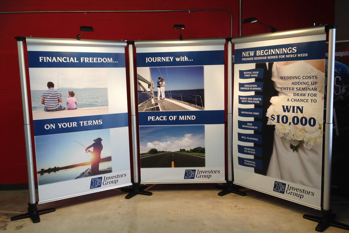
Designing a trade show booth starts before you create graphics or layout structure for your booth and will end with the impact it’ll have on your audience. Listed here are 6 tips to take into consideration as you design your trade show display.
Pick an Objective
Before designing a trade show display, you’ll have to determine who your target audience is and what the goal is as you grab their attention. It might appear obvious, because you likely know the market and purpose for your business. But, attendees at the trade show might be somewhat different. You really must put yourself in the shoes of your audience and discover what would make somebody visit your booth.
Reserve Booth Early
Some trade show booths are challenging to reserve, because the same companies attend each year, or they might be prime locations and very expensive. In case you get a say in the booth you want, select the best available location. Attempt to gain a corner booth space or one close to the front of an aisle, for instance.
As you know the location and size of your booth area, it is possible to determine the best method of laying out your display so that it’ll attract folks in and have good flow of traffic. Consider how attendees are going to maneuver around the booth if it gets really crowded.
Think Bigger
Consider ideas and ways you can make the booth more attractive both from a distance and close up. Massive overhead hanging banners that are suspended from the ceiling may attract more attention to the trade show booth.
Restrict the Amount of Colors
You may want to add a splash of color to the booth design; however, do not want the booth to look like a rainbow. An excellent tip is to restrict your color palette to 2 or 3. Otherwise, you’ll risk your message being lost in the pops of color. It’s simple for folks to become distracted with the design, as the design actually should compliment your message.
Carefully Select Your Fonts
It is vital that you consider which typefaces and fonts you’d like to use in your booth design. Take into account how various fonts may appear in smaller print and in larger print, as your design probably will have both. How is the font going to appear from a distance? Is the font easily readable at a glance? How will it appear up close? Artsy scripts and fonts often don’t translate well for signs; therefore, you should avoid them.
Keep All Text at Eye Level
Consider the impact your signs have as attendees approach the booth. As you want to place signs high to be seen from a distance, you also want to place it personal and close to floor displays. Avoid placing text and content down at people’s feet. You should instead place the tagline at eye level.
For more information on our innovative signage solutions contact Speedpro London today!


