Types Of Decals And Labels We Offer
Equipment Decals
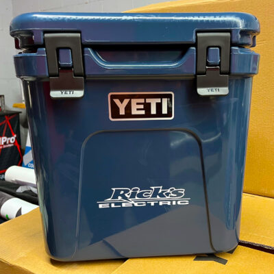
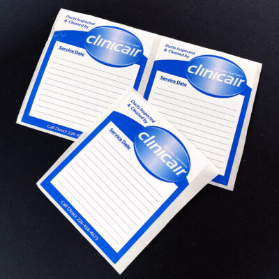
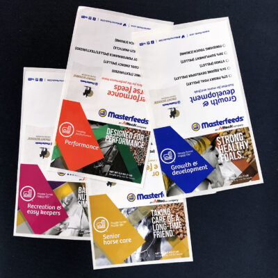
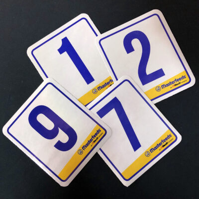
Equipment decals can help you advertise your business and increase brand awareness. Farming or operating heavy machinery? Our equipment decals help you get your name out there, whether you’re working in the field or on the road. Installing HVAC equipment or appliances in a customer’s home? Equipment decals will keep your brand standing out in your customers’ minds every time they look at the equipment you installed.
Product Labels
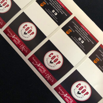
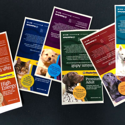
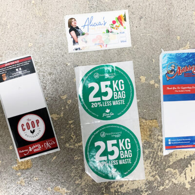
Product labels are a staple for small and large businesses alike. A custom product label can help you develop brand awareness, advertise your products, and give customers detailed descriptions of what the products are and how to use them – all in one. We design custom product labels that perfectly fit the packaging you’re using.
Die-Cut Vinyl Decals
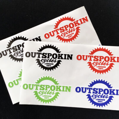
Our die-cut vinyl decals are incredibly durable; they’re also among our most customizable decals. Die-cut means that these decals can be cut in whatever shape you desire; perfect for brands that want to stand out from the competition. Put these decals on products and/or send them as stickers with mail order purchases – the sky’s the limit.
Specialty Finishes
Looking for a plain, matte label? Want foil or metallic finishes on your decal? Whatever you have in mind, we can help. We offer a number of different specialty finishes that can be applied to part or all of your label or decal – just one more way we can help your printed materials match your unique branding needs.
Materials And Customization Options
Our decals are made out of a variety of different materials, including vinyl and other plastics. They are fully customizable – you pick the size, the shape, the colour, the images, the calls-to-action, and the finishes you want, and we handle the rest. Our in-house graphic design team can help you design labels and decals that are perfectly customized to fit your brand.
We work with experts like 3M and Avery to source the materials we use for our decals and labels. The result? High-quality printed materials that are as durable as they are eye-catching.
Why Choose SpeedPro London For Your Decals And Labels?
For over 15 years, SpeedPro London has served businesses in London, ON, and the surrounding area, providing high-quality decals and labels for everything from products to vehicle branding.
We’ve succeeded in the industry because of our commitment to customer satisfaction, quality products, and innovative design. Our in-house graphic design team, coupled with our printing capabilities, means we can design labels and decals that help you grow your business and your brand.
Whether you’ve got a fully realized design that you need printed or a couple of ideas jotted on the back of a napkin, our team can help you make your ideas for labels and decals real.
Design Tips And Best Practices
Do’s & Don’ts For Designing Decals, Stickers, Or Labels
The first step is choosing your design; seems easy enough, right? The higher contrast images are better to use, as they are usually cleaner and have bright colours.
#1 Simplify your design, especially if it is a message you want to relay. A large, complicated decal or sticker is not going to catch anyone’s attention.
#2 While it is true that bigger objects are easier to see, you have to keep your audience in mind.
#3 Think about being more unique in shape. While rectangles are nice, they are grossly overused.
#4 You don’t have to be a stagnant sticker maker; backgrounds can incorporate colour.
#5 Put some small advertising information on it, something that will make the consumer want to dig a little deeper.
#6 Adjust your levels of stickiness appropriately. It is typically not a good idea to use face adhesives, as it limits the placement prospects and are less likely to be used.
Whether you’re attempting to sell your own products or trying to help your clients sell their products by offering great design, learning how to design a product label or sticker that will make products fly of the shelf.
Do:
- Keep designs simple
- Use contrasting colours
- Size your labels and decals properly for your product
- Use easy-to-read fonts for descriptive text and calls-to-action
- Include your logo
- Use your brand colours
Don’t:
- Use more than 2 or 3 colours
- Clutter the design with too much text or too many images
- Use more than 2 different fonts
The goal of decals and labels should be to draw attention; once a person’s attention has been drawn, the decal or label should be easy to read and understand. Simple designs are usually best!
Frequently Asked Questions
We can! Simply let us know what shape or size you have in mind; we can die-cut labels and decals in virtually any shape.
How long our labels and decals last depends on where and how they are used. In many cases, they can last for years; we manufacture decals for vehicle branding, and those can last for 5 years or longer with proper care.
We manufacture both water-resistant and UV-resistant decals. Heavy equipment decals and vehicle decals must be both water-resistant and UV-resistant to last as long as possible, but you should still avoid leaving them out in the rain or in harsh sun to maximize their useful lifespan.
Our decals and labels are often made from vinyl, but can be made from other plastics. We work with manufacturers like 3M and Avery for our materials, so our decals and labels are extremely durable, with long-lasting adhesives.
We accept a variety of file formats for art submissions, but you should know that some file types work better than others. AI, PSD, INDD, and PDF are often the best working file types that allow us to modify artwork and designs. Other file types, like JPG and PNG, are also acceptable, but compression may cause some loss in quality.


